The Mysteries of Songs

  1. What were your inspirations for creating the album cover art?

My inspiration was Tyler The Creator as he creates really different and diverse albums with a ton of creativity. I thought of putting something random that represents errines as most of my songs have no words and only beats.


  1. Which Adobe programs, CRAP principles (contrast, repetition, alignment, proximity), and digital techniques or trends did you use, and why did you make those choices?
    I used proximity and alignment, this is because I wanted to create a feeling of mystery as you don’t really know what is out there. I wanted to really create something that gives the creeps and goosebumps as feelings are very important when representing an album cover.


  1. What do you intend for audiences to see, experience, and think about when viewing your work?

I intend my audiences to have feelings of errines, I want them to feel creeped out by the look of my album cover. I want a feeling of urgency to find out what the music is. The whole idea is to catch their eye by creating pictures that look mysterious.


  1. Which are the most successful aspects of your work?

I really like my front cover because of the UFO and the Ai person. I made the person blurry to get rid of the realism and make it more cartoon-like.


The “Chemistry” behind ‘Marie Curie.’

Describe your artwork:

My women’s history month art piece features ‘Marie Curie’ who once was a famous chemist who was well known for their contribution and research of radiation. The main focus behind this art piece was to display her occupation along with her bravery of focusing on radiation; not only is it a hard job, but she contributed to the future of humanity. 

How did you create your artwork:

This artwork was made with Adobe Photoshop along with Adobe Illustrator. Firstly, a photo of Marie Curie was chosen and the background was then removed. After doing so, certain colors that fit her occupation and her motive were picked out. Once the colors were decided on, I then messed with the gradient maps. Once the colors mixed together, I added a border along with a small pattern to bring it all together. Lastly, I finished by putting her name and a description along with a big word that represents her as a person. 

What is the ‘Big’ idea behind your artwork:

The big idea behind this artwork was to display Marie Curie’s occupation along with her contribution to the world. I wanted to have something eye-catching, something that stopped people while walking; by mixing the colors and having the word ‘Vigorous’ in bold letters, made that goal a reality. 

What were your goals behind this artwork:

As I said before, I really wanted to have an eye catching art piece that demonstrates National Women’s Month, which was easily accomplished by choosing colors that display her job and her accomplishments. Marie Curie contributed a ton to radiation research, and by displaying colors like green and blue, correctly shows her goals in life. 

What are your overall thoughts on your artwork:

I really enjoyed making this art piece, this is my favorite work I have done this year so far. I really enjoyed choosing colors that represent Marie Curie. Everything looks blended together and the colors were a perfect match to the art piece. I like the word placement of ‘Vigorous’ as it is very eye-catching.

The Inspiration Behind ‘Naive.’

  1. What is the type of business you designed your logo for? Explain.
  2. How does the logo represent your business? Explain.
  3. Who is the target audience for your business? Explain.
  4. How does the logo appeal to that target audience? Explain.
  5. What are you the proudest of in this piece of artwork?  Explain.
  6. What could you have done better? Explain.

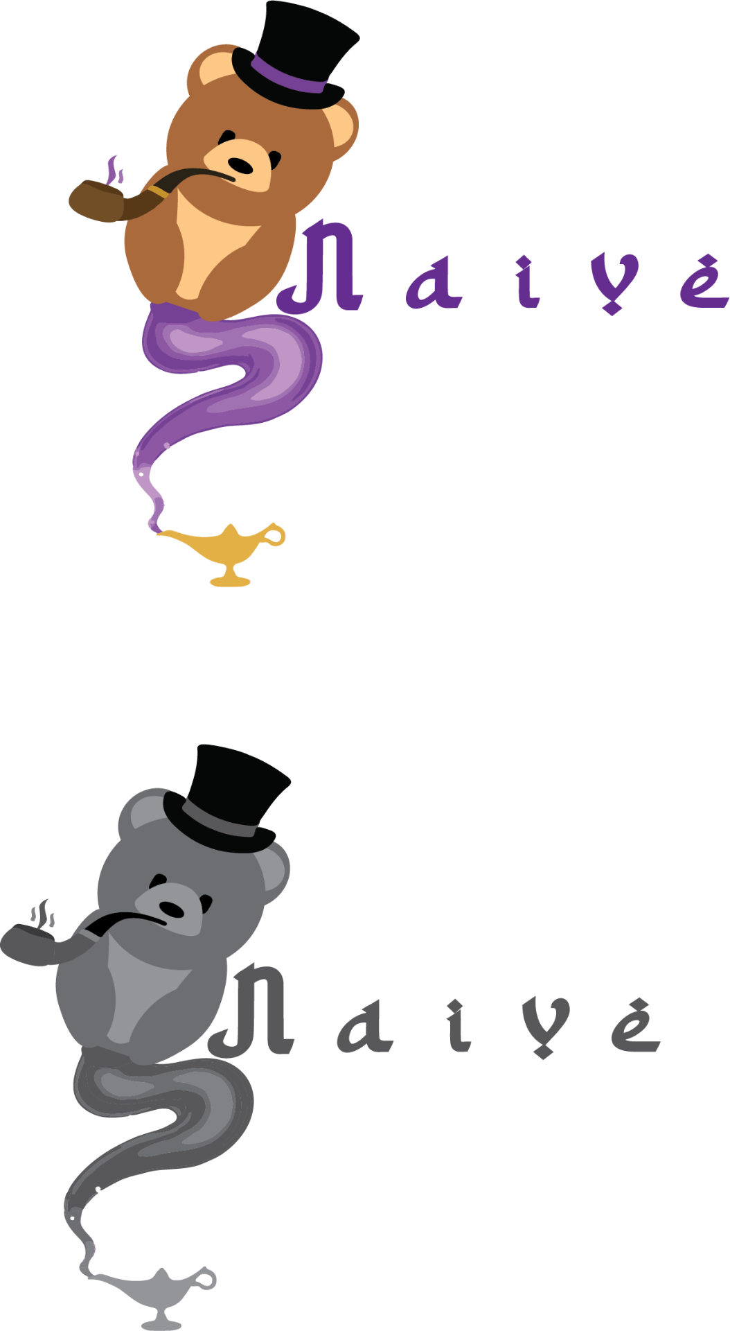
I designed my logo for a clothing company, the clothing company prioritizes their development with jeans and t-shirts. The logo represents the true meaning of the word ‘Naive.’ The teddy bear with the pipe represents a teenager – young adult doing actions that are meaningless, then the tail represents the creativity the company has with clothing.

The target audience is a young demographic, the goal is to sell teenagers to young adults. Eventually we will expand into a clothing company that sells to all ages. 

The logo is eye-catching, most logos don’t look like ours, the randomness is different and unique compared to most.

I am proud of the teddy bear itself, this is because it was made on paper and then was transformed onto the computer, it isn’t from the internet and it’s completely my idea. 

I would have taken more time on the tail and tried to form it as an underline under the word ‘naive.’

Pictogram Creativity


  1. What is the subject of your illustration and why did you choose it? Explain.


  1. What do you like about your art? Explain.


  1. What advice would you give another student before they begin the pictogram technique? Explain.


The subject of my illustration was “The Exorcist.” I choose this subject because the movie interests me into different types of genres for films. Considering it was a way different movie then most, I thought it would be interesting to have a pictogram consisting of the main part of the movie, this main part of the movie is well known throughout the film industry due to its creativity. 

I like that my art consists of the main part of the movie, it has a huge difference when it comes to everyone else’s pictogram considering the fact that my character is floating in the air above a bed. I also like that my art shows a sense of fear with the bold red as the background along with a scary font. 

Some advice I would give to people who are interested in doing a pictogram is to be very creative, do something out of the ordinary to make it stand out to everyone who views the pictogram, and make it interesting to the public eye.

 palm_anthony_14_pictogram

The Development of Art

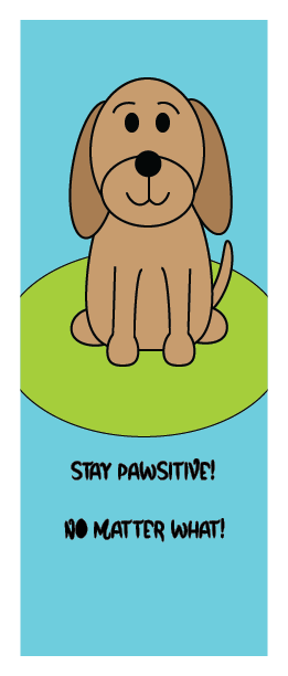
After developing a card, I decided to add certain qualities that would cheer up a child. I choose a common animal that almost everyone loves, which is a dog. I included a dog to display comfort, love, and happiness. 


At first I thought of using a shark from one of the reference books, but after a short thought I decided to go with a dog as it’s more comforting towards a child. I surfed the internet and found a cartoon styled dog to style my art off of. I used numerous tools including the shape and line tool, the fill in tool, and the anchor tool. These were all important tools that allowed me to correctly display the true form of a dog. 


My big idea for the artwork was to display a comforting and light hearted cartoon that would cheer up any child going through hardship. I tried to display happiness and joyfulness along with a silly message that would put a smile on anyone’s face. 


My main goal for this artwork was to make the child laugh or smile in the most comforting way possible. I wanted to remind them that everything will be alright. 


Something I learned while creating this art piece was how to use certain tools better. One example of this is the anchor tool, I created new shapes that were descriptive to a dog. The artwork came out exactly how I wanted it too, I would like to add a more detailed background the next time we do this.